Tuesday, July 22, 2014

Construction Update - Interior

It's amazing what drywall does to make the interior of the house look like a .... well, house! Seemed like nothing was going on for weeks (between May and June), and then, bam!, they installed drywall at the end of June.

June 26: Interior Drywall


 July 8: Fireplace in Great Room

 
July 21: Kitchen Cabinet Installation
Notice anything?  They ordered the WRONG cabinet style.  Remember Cabinet Gate? After all that back and forth, our final selection was the modern/Shaker style cabinet; but the sub-contractor misread the order (went by the old paperwork) and we received the traditional style cabinets! :(  Fortunately, they'll be able to swap out the doors since the material and color are the same without delaying our close date. Whew!
 
Evolution of Our Staircase
June 26: Drywall

July 18: Stair base/border

July 20: Stair Rail!

 
Some Interior Design Selections 


Construction Update - Exterior

It's been almost two months since my last update and so much progress has been made!  Our little plot of land actually looks like a house now both outside AND inside.  Since there are so many pics to share, I'll be splitting this up into an exterior construction update and then follow-up with an interior contruction update.  Happy viewing!

June 7: Just had to...my princesses in front of their new house (plus, needed an excuse to wear their pink construction hats!)


June 23: Outside Wrap of House (protects it from water damage?)

June 25: Outside Stucco

June 26: Outside Trim
 
July 8: Exterior Paint


July 16: Exterior Paint + Scaffolding Gone!


Wednesday, June 11, 2014

Construction Update

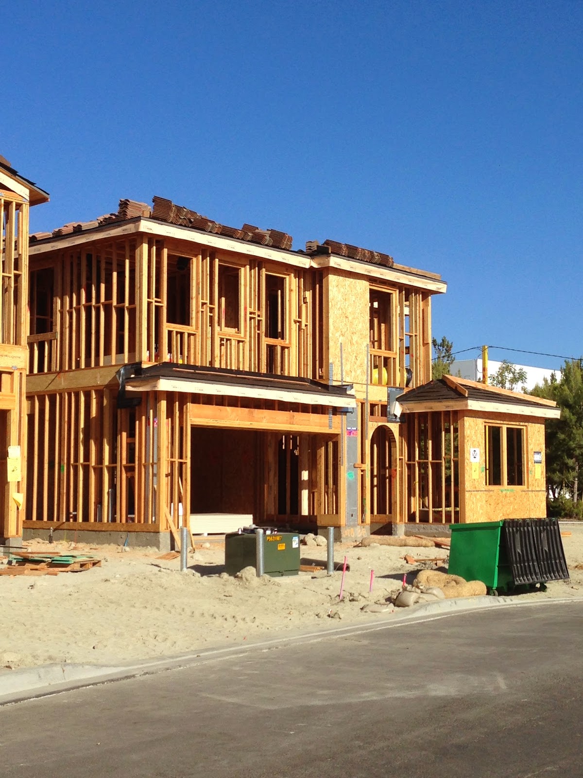
Since the last contruction update, so much has been accomplished on the house! We went from the first floor framing to the whole house being framed and the roof being ready to be tiled! 

May 9: Interior First Floor Framing
Our curving staircase - one of my fave parts of the house!

I think this is supposed to be where our kitchen is? Either that or the great room...ha!
 
May 22: Second Floor Framing 


June 4: Ready to be Roofed!
 
 
Next up, our framing/electrical walk through!  Once that's complete things are supposed to move fairly quickly. We're also in the process of finalizing our flooring and bathrooms...it's been very hard to stay within our budget!


Monday, June 2, 2014

rub-a-dub-TUB

Here we go again...this time with our master bathroom, specifically the bathtub. At our initial design meeting the price difference between a built-in tub and a free-standing was so great that we didn't even entertain the idea.  Although we loved the look of a free-standing tub, it went way down on our priority list as a "nice-to-have" instead of a "must-have."

Fast forward to a couple weeks ago when we were pricing out options for the deck and face. Hubby and I wanted the tub deck/face to be in the same stone as our master bathroom sink countertops.  When we got the estimates back we were shocked to discover there wasn't a significant difference between getting the built-in tub and the free-standing one!

If we went with the built-in tub with the same stone as the sink countertops, here's what it would like like.
Picture from the model house.  Unfortunately, ours won't be as amazing as this master bath!

When we realized the closeness in cost, we went back and looked at the free-standing tub options. And, of course, I had to lay out all my options!

All free-standing tub options as well as tub faucet options (comparing them to our sink faucets to ensure they complemented each other).
 
Being the nerd that I am, I had to try and visualize each tub with the each tub faucet. :)  
In the end, we went with the Starstruck tub/Finial Traditional faucet. We also really like the look of the built-in tub, but felt the free-standing tub was a little more modern and fit our design style better. We will probably get zero use out of the tub, but, hey, at least it'll look nice!

Tuesday, May 27, 2014

Cabinet Gate

Remember how I mentioned in a previous post that my hubby and I like to think about things and weigh all our options before making a decision?  And remember how I mentioned we felt pressured to make the FINAL decision on certain things at the first design meeting? Well, we felt a little heartburn on the decision of our cabinets.  We equally loved both style of cabinets...beveled/raised panel and more flat/Shaker panels.  At the initial design meeting we went with the more traditional style cabinet (shown below on right), but felt like the modern Shaker cabinet (shown below on left) suited our style better. However, we didn't pull the trigger on the Shaker style because the designer was told us it would cost almost an additional $12K to have those cabinets throughout the house. Easy decision to make to choose the $0 traditional style, right???

 
Things changed when we found out (through some poking and prodding on my end) that the Shaker style was, in fact, a standard option (the designer apparently wasn't aware of this). We were thrilled to find out it was available at $0 upgrade costs! Woo-hoo!

But...Now what? What do we choose? Hubby and I went back and forth, frantically researching on Houzz between the two styles, and trying to also decide on the overall look we were trying to achieve. Verdict? Went with the Shaker style cabinets...still transitional with a little more of a preference toward contemporary/modern.

Here's a look at what we went through to select the cabinet style...


Tuesday, May 6, 2014

What's Your Style?

Based on all those design style quizzes, ours is transitional.

According to HGTV: Transitional style is a marriage of traditional and contemporary furniture, finishes, materials and fabrics equating to a classic, timeless design. Furniture lines are simple yet sophisticated, featuring either straight lines or rounded profiles.

According to Houzz: If Goldilocks were decorating a house, transitional style would check all of her "just right" boxes: not too cold, not too formal, not too fussy. It blends the comfort and warmth of traditional design with the clean profiles and understated colors of the contemporary look. The result? Gracious, streamlined spaces that radiate harmony. It's about meeting in the middle, but it's not at all middle of the road.
Here are some of my fave inspo pics that I've been using to base our design decisions on.

Kitchen (can you tell all white is the theme here?)


Great Room:


 Master Bedroom


Home Office

Saturday, May 3, 2014

Designs and Thangs (Toll Brothers Design Meeting #1)

Things are moving along at our dream home! So far, we've selected our electrical and some design options...never knew there was so much to consider.

For electrical  I was surprised that recessed lighting did not come as a standard feature in so many rooms (grrrrr!).  We had to put in "new" lighting in the great room and 6 rooms (office + bedrooms), and add extra lighting in the kitchen/dining room and the entry/hallway.

On to design options. At each design meeting, you sign an "Exhibit B" which is a legal agreement for all the add-ons to the house. Hubby and I are the type who need time to mull over things and weigh all our options before we make a decision and love to google all possibilities, so the first design meeting made us feel the pressure since we had to make decisions right then and there.

B-U-T...since we weren't allowed some time to think before we selected, here are the choices we made on-the-spot during our first design meeting and pictures pulled from the lovely internet (thanks Houzz!) to give you an idea of where we're going:
  • White cabinets throughout house (kitchen and bathroom)
  • Furniture package at kitchen (ktichen cabinets go all the way up to ceiling, extra grommets at kitchen island) and different kitchen island stain
 
  • Arched buffet above window that connects kitchen cabinets
  • Kitchenaid 48" built-in side-by-side refrigerator
  • Kitchenaid 48" rangehood and 6 burner cooktop with griddle
 
  • Kohler Bellera kitchen faucet
  • Satin knickel finished knobs/pulls for cabinets and plumbing fixtures 
 
  • Solid core interior doors (which the Sales Manager and I both agreed should be a standard feature but isn't) and Kwikset Tustin satin nickel door handle 
  • Kohler Devonshire plumbing fixtures for sinks and showers (Devonshire is the standard feature for our home, we just upgraded to the satin nickel finish; this wouldn't have been our first choice, but you have to make sacrifices somewhere!)
  •  Front entry door (not pictured) - upgraded to dark stain

Stay tuned for more design decisions...countertops and flooring come next!